Cloud spending is one of the largest operational expenses for UK businesses, but understanding where the money goes can be difficult. Cloud cost report visualisation simplifies this by turning complex billing data into clear visuals like charts and dashboards. This helps businesses track spending, identify waste, and make smarter decisions.
Key Takeaways:
- What it is: Visualising cloud costs using tools like pie charts, line graphs, and heat maps to highlight spending patterns and inefficiencies.
- Why it matters: It provides transparency, consolidates multi-cloud data, improves accountability, and aids budget planning.
- Challenges: Hidden costs, resource sprawl, complex billing, and lack of real-time visibility are common issues without proper tools.
- Tools: Options include native tools (AWS Cost Explorer, Azure Cost Management, Google Cloud Cost Management) for single-cloud setups or third-party platforms for multi-cloud environments.
- Techniques: Standardise data, use consistent tagging, and choose the right visual formats (e.g., time-series graphs for trends, pie charts for allocation).
- Actionable insights: Set alerts for unusual spending, analyse usage patterns, and tailor reports for different stakeholders (executives, finance, engineering, and department heads).
By combining visualisation tools with structured reporting, businesses can reduce waste, optimise usage, and control cloud costs effectively.
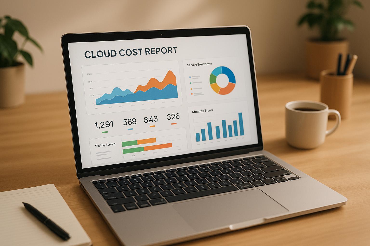
Cloud Cost Dashboard Demo
Cloud Cost Visualisation Tools
Picking the right tool to visualise cloud costs can make a big difference. Broadly, you have two options: native tools from cloud providers or third-party platforms that work across multiple clouds. Each has its strengths, and the right choice depends on your organisation's specific needs and setup.
Native Cloud Provider Tools
Major cloud providers like AWS, Microsoft Azure, and Google Cloud offer their own cost management tools. These tools are tailored to their platforms and provide detailed insights into spending.
AWS Cost Explorer: This tool provides interactive charts that break down costs by service, region, or tag. It’s great for spotting trends over time and even includes forecasting features to predict future expenses based on historical data. There are also pre-built reports to help identify unused EC2 instances or monitor Reserved Instance usage. However, it’s limited to AWS, so it won’t help if you’re using multiple cloud providers.
Microsoft Azure Cost Management + Billing: Azure’s tool focuses on budgeting and cost allocation. You can set spending limits for specific departments or projects and receive alerts when those limits are close to being reached. It’s particularly handy for organisations already using other Microsoft services like Office 365, as it consolidates costs across these platforms. The dashboards are simple and user-friendly, making them accessible even to non-technical users.
Google Cloud Cost Management: Google’s tool stands out for its anomaly detection, which uses machine learning to flag unusual spending patterns. This real-time monitoring can be invaluable for catching issues like misconfigured auto-scaling or unexpected traffic spikes. Dashboards update throughout the day, offering more immediate insights compared to tools that rely on daily billing cycles.
While these native tools are powerful, they fall short in multi-cloud environments. If your organisation uses multiple providers, you’ll need to juggle several dashboards to get a complete picture of your costs.
Third-Party Platforms
Third-party tools are designed to solve the multi-cloud challenge, offering a unified view of spending across providers. They often include advanced features that go beyond what native tools can do.
These platforms aggregate billing data from various providers and standardise it, making it easier to compare costs across AWS, Azure, and Google Cloud. For example, you can see how much it costs to run the same workload on different platforms using consistent metrics. Some tools even offer recommendations for where to place workloads for better efficiency and cost savings.
Sophisticated third-party platforms also excel at spotting inefficiencies. While native tools might highlight obvious spikes in spending, third-party solutions can uncover subtle patterns. For instance, they might detect that database costs consistently rise on weekends, suggesting a misconfigured backup process or unnecessary tasks.
Another standout feature is AI-powered recommendations. These tools analyse usage data and suggest actions like resizing instances, purchasing Reserved Instances, or moving data to less expensive storage tiers. They often quantify potential savings, helping teams prioritise changes that deliver the most impact.
Additionally, third-party platforms offer custom reporting and alerts. You can create detailed alerts based on complex criteria, such as flagging when development environment costs exceed 15% of production costs for several days. This level of granularity is typically beyond the capabilities of native tools.
However, these platforms come with extra costs and require setup. Security is another consideration, as you’ll need to grant them access to sensitive billing data. Despite these challenges, they’re an excellent choice for organisations managing multiple cloud environments.
How to Choose the Right Tool
Selecting the right tool depends on your cloud setup, team expertise, and budget. Here’s what to consider:
Infrastructure complexity: If you’re using a single cloud provider, native tools are usually sufficient. For multi-cloud environments, third-party platforms are more effective.
Team size and expertise: Smaller teams may prefer native tools for their simplicity. Larger organisations with dedicated FinOps teams often benefit from the deeper insights and automation provided by third-party platforms.
Budget: Native tools are often free or included with your cloud services, while third-party platforms typically charge a subscription fee or take a percentage of managed cloud spending. The extra cost can be worth it if the platform helps you save more in the long run.
Integration needs: Third-party platforms often integrate with financial systems and business intelligence tools, making it easier to include cloud costs in broader financial reports. Native tools may be limited to their ecosystem.
Compliance and security: Regulated industries might prefer native tools, as they keep data within the cloud provider’s infrastructure. Third-party platforms require a thorough review of their security practices.
For organisations unsure about where to start, consulting firms like Hokstad Consulting can provide tailored advice. Their cloud cost engineering services include tool selection and implementation, ensuring you choose a solution that aligns with your goals.
Many organisations begin with native tools to establish basic cost visibility and later move to third-party platforms as their needs grow. The goal is to find a tool that turns your billing data into clear, actionable insights, helping you make smarter decisions about your cloud spending.
Cloud Cost Visualisation Techniques
Once you've chosen your tools, the next step is turning raw billing data into clear, actionable visuals. How you organise and present this data can either simplify decision-making or create unnecessary confusion.
Data Collection and Standardisation
The first step in creating reliable visualisations is ensuring you have a unified data source. This can be tricky when working with multiple cloud providers, each using different billing formats, terms, and update schedules.
Start by consolidating billing data across providers into a standard format. For example, AWS categorises compute costs as EC2-Instance
, Azure uses Virtual Machines
, and Google Cloud refers to them as Compute Engine.
Without standardisation, comparing costs across platforms becomes nearly impossible.
Consistent tagging is another must-have for useful visualisations. Implement a company-wide tagging policy that includes fields like department, project, environment (production, staging, development), and cost centre. Inconsistent tags - like Marketing
, marketing
, or Mktg
- can fragment your data and obscure the bigger picture.
Data update frequencies also vary by provider. AWS Cost Explorer updates daily, though some details may lag by 24–48 hours. Google Cloud offers near real-time updates for some metrics, with others refreshing every few hours. Knowing these timelines ensures your visualisations are based on the most accurate data available.
For UK businesses operating globally, currency normalisation is critical. Cloud providers often bill in different currencies - USD for AWS, EUR for some Azure regions, and GBP for UK-specific services. Converting all costs to pounds sterling ensures accurate comparisons.
Unallocated costs from untagged resources can throw off your visualisations. Automate processes to identify and address these gaps, preventing misleading data.
Once your data is standardised, the next step is choosing the right visual formats.
Chart Types and Visual Formats
The right chart can make complex data easy to understand. Here are some formats to consider:
- Time-series graphs: Perfect for showing cost trends over weeks or months. These help identify seasonal patterns or the impact of specific changes.
- Stacked area charts: Ideal for breaking down costs by service type (e.g., compute, storage, networking). This format highlights both overall trends and individual contributions, making it easy to pinpoint cost drivers.
- Heatmaps: Great for spotting cost hotspots across regions or services. For example, a heatmap could reveal that database costs in the US East region are disproportionately high compared to other locations.
- Pie charts: Best for showing resource allocation at a specific moment. Keep them simple by focusing on the top five or six categories, grouping smaller items into an
Other
segment. - Waterfall charts: Useful for illustrating cost changes over time. These charts show starting costs, factors contributing to increases or decreases, and the final total, helping teams understand what drove changes.
- Scatter plots: Ideal for uncovering relationships between metrics. For instance, plotting CPU utilisation against cost per instance might highlight underused, expensive resources that could be downsized.
Avoid overly complex visuals like 3D charts or dual-axis graphs, as they can distract from the data's message.
Once you've clarified trends with visualisations, the next step is setting up intelligent alerts to act on those insights.
Alerts and Monitoring Setup
Visualisations are just the beginning - proactive monitoring ensures you catch issues before they escalate. Alerts turn your visual data into actionable insights.
- Threshold-based alerts: These are straightforward and trigger when costs exceed a set limit, like £10,000 monthly AWS spending. While simple, they can generate false positives or miss gradual increases.
- Anomaly detection: This approach learns normal spending patterns and flags unusual deviations. For instance, it might detect a drop in development costs over weekends or unexpected spikes during off-peak times.
- Predictive alerts: Using historical data, these alerts forecast when you'll exceed budget limits. Instead of reacting to overspending, you get advance warnings to make adjustments.
- Multi-dimensional alerts: These monitor combinations of metrics. For example, you could set an alert if development costs exceed 25% of production costs for three consecutive days, signalling potential resource mismanagement.
Balancing alert sensitivity is key. Overly sensitive alerts can cause alert fatigue
, while under-sensitive ones might miss critical issues. Establish clear escalation procedures - for example, a 10% budget variance might warrant an email to the development team, while a 50% spike could require immediate action from both technical and financial stakeholders.
For expert advice on refining alert thresholds, check out Hokstad Consulting. Their expertise in DevOps and cloud infrastructure can help build effective monitoring systems.
Finally, schedule regular alert reviews to refine your setup. Monthly sessions to evaluate which alerts were helpful and which were noise will improve your system over time. This iterative process ensures your visualisation and alerting strategies stay aligned with your organisation's needs.
Need help optimizing your cloud costs?
Get expert advice on how to reduce your cloud expenses without sacrificing performance.
Cloud Cost Report Presentation
A well-prepared cloud cost report doesn't just present numbers - it drives action by making data clear and meaningful. Building on earlier discussions about visualisation techniques, the next step is to structure and format your reports in a way that resonates with different audiences. Each group of stakeholders has unique needs, and tailoring your reports to these needs can mean the difference between clarity and confusion. Here's how to present these insights effectively.
Reports for Different Audiences
Different stakeholders require different levels of detail in their reports. Here's how to approach each group:
- Executives: Focus on high-level trends and the overall business impact.
- Finance Teams: Provide detailed cost breakdowns and projections.
- Engineering Teams: Share operational metrics and resource usage.
- Department Heads: Highlight team-specific spending.
For executive reports, keep it concise - one or two pages at most. Highlight key metrics like month-over-month changes, budget variances, and cost per customer or revenue. Simple visuals, such as a 12-month trend line for total spending, paired with brief explanations, work best.
Finance teams need granular details to manage budgets and forecasts. Include cost centre allocations, departmental spending, and variance analysis. Tables comparing actual versus budgeted spend, with notes on major discrepancies, can help them stay on top of financial planning.
Engineering teams require a breakdown of costs by service, environment, and project. Combine spending data with operational metrics, such as showing that development environments cost £15,000 last month but only achieved 12% CPU utilisation. This level of detail helps them identify inefficiencies.
For department heads, focus on what’s relevant to their team. A marketing director, for example, doesn't need a full engineering cost report. Instead, highlight spending on analytics tools, campaign tracking systems, and any cloud resources tied to marketing initiatives.
The golden rule? Match the level of detail to the audience's decision-making needs. Executives need strategic insights, while technical teams require actionable, detailed data.
UK Formatting Standards
Tailoring your reports to UK standards ensures clarity and professionalism. Here are some key formatting guidelines:
- Use the pound sterling symbol (£) directly before numbers, e.g., £1,234,567.89.
- For human-readable sections, write dates in the day-month-year format, such as 15 September 2025. When space is tight, use DD/MM/YYYY (e.g., 15/09/2025). For machine-readable data, use ISO 8601 (2025-09-15).
- Insert commas as thousands separators and full stops for decimals.
- Write percentages without a space before the symbol, e.g., 23.5%.
- For large numbers, use terms like
million
orbillion
for simplicity - e.g., £2.3 million instead of £2,300,000. - When referencing temperatures (e.g., for data centre discussions), use Celsius. For storage, stick to metric units like gigabytes or terabytes rather than binary equivalents.
Key Metrics and Data Points
Your reports should centre on the metrics that matter most for decision-making. Here’s what to include:
- Spending Trends: Highlight total costs with comparisons to previous periods. Month-over-month and year-over-year changes provide context for whether fluctuations are normal or require attention.
- Cost per Unit: Depending on your business, this might mean cost per customer, transaction, or active user. These metrics show whether spending aligns with business growth.
- Resource Utilisation: Pair spending data with usage metrics. For instance, if compute costs rose by 25% but average CPU utilisation dropped to 15%, it signals inefficiency.
- Budget Variance: Compare actual spend to budgeted amounts, flagging categories that exceed expectations with concise explanations.
- Forecasting: Provide projections based on current usage patterns, showing expected monthly or quarterly costs along with confidence intervals. This helps teams prepare for the future.
- Top Cost Drivers: Identify the five most expensive services or resources, showing both their absolute costs and their percentage of total spending. This helps prioritise optimisation efforts.
For businesses needing expert help with structuring these metrics or creating effective reports, Hokstad Consulting offers tailored cloud cost engineering services designed specifically for UK businesses.
The best reports strike a balance: they provide enough detail to inform decisions without overwhelming the reader. Aim for clarity and actionability, ensuring that every piece of data serves a purpose.
Cloud Cost Audit Reporting in Practice
Conducting a cloud cost audit involves turning raw data into meaningful insights that can guide decisions and reduce expenses. This process requires a structured approach to gather, analyse, and present findings in a way that supports smarter spending and long-term efficiency.
Cloud Cost Audit Process
The first step in a cloud cost audit is resource inventory and discovery. This means creating a full list of all cloud resources across accounts, regions, and services. Think of everything: active instances, storage volumes, databases, networking components, and even overlooked items like load balancers or NAT gateways. Many organisations are surprised to find they’re paying for idle resources - things like unused development environments, orphaned storage volumes, or test instances that were never shut down.
Next comes cost allocation and tagging analysis. This step involves reviewing how costs are distributed across departments, projects, or cost centres. Poor tagging practices can make it hard to track spending accurately, so this is a chance to fix gaps and organise costs into categories like production, development, testing, and shared services.
Another key part of the audit is usage pattern analysis. This involves comparing what you’ve provisioned to what’s actually being used. For example, are there instances with low CPU utilisation? Storage allocations that are far larger than needed? Services running during off-peak hours? Identifying these patterns can reveal where money is being wasted.
Finally, benchmark establishment sets a baseline for future comparisons. Documenting current spending, utilisation rates, and cost-per-unit metrics gives you a reference point to measure the success of optimisation efforts. It also helps flag when costs start increasing unexpectedly. Once these benchmarks are in place, the next step is to turn the data into visual reports that make the findings clear and actionable.
Converting Audit Data to Visual Reports
To make audit findings useful, it’s essential to present them in visual formats that are easy to understand. Start with a cost allocation pie chart to show spending by department or project, highlighting any unallocated costs. Utilisation heatmaps are another great tool - they show how efficiently resources are being used over time or across services. For instance, a colour-coded grid can quickly reveal underutilised resources.
For trend analysis, combine line and bar charts to display how costs have changed over time alongside utilisation rates. Dashboards that show metrics like cost per customer or transaction can also help stakeholders determine whether cloud spending aligns with business goals.
Every visual report should include actionable recommendations. Whether it’s resizing instances, automating schedules, or eliminating redundant services, linking visuals to clear next steps ensures the data leads to real savings.
Working with Cloud Cost Consultants
Sometimes, it helps to bring in outside expertise to review audit results and suggest optimisation strategies. For example, Hokstad Consulting offers cloud cost engineering and audit services for UK businesses. They’ve helped companies cut cloud expenses by 30–50% through detailed analysis and tailored optimisation plans. Their input can strengthen your audit process and integrate cost-saving measures into your broader cloud strategy.
Conclusion
Managing cloud costs effectively is a priority for UK businesses striving to curb unnecessary spending and avoid waste. Without access to real-time visual dashboards, organisations risk overlooking early warning signs of rising expenses, leading to less informed financial decisions.
The strategies and tools discussed here are designed to transform raw cloud data into practical insights, with visualisations tailored to the needs of different audiences. However, it all starts with the basics - consistent data standardisation and accurate tagging. Without these, even the most advanced dashboards fall short of delivering meaningful insights.
The outlined audit process highlights how a systematic approach can lead to noticeable cost reductions. By converting findings into clear visual reports, businesses lay the groundwork for smarter, data-driven optimisation decisions.
For organisations aiming to take their cloud cost management to the next level, working with experts like Hokstad Consulting can make a real difference. Their cloud cost engineering services are designed to help businesses build the monitoring and reporting systems needed for sustainable cost control.
FAQs
Should I use native cloud tools or third-party platforms to visualise cloud costs?
Deciding whether to use native cloud tools or third-party platforms comes down to how complex your cloud setup is and what your organisation specifically needs. Native tools work well for single-cloud environments, offering smooth integration and easy-to-use reporting features. But they might fall short if your requirements are more advanced.
For businesses managing a multi-cloud environment or needing features like automation, in-depth analytics, or tailored reporting, third-party platforms often offer a broader range of capabilities. To choose the right option, think about your budget, what you want to achieve with reporting, and your long-term cloud strategy.
How can businesses standardise cloud billing data across multiple providers?
To bring order to cloud billing data from various providers, the first step is setting up a centralised billing repository. This acts as a single hub where raw billing data from all providers is collected and organised. With everything in one place, analysing and managing cloud expenses becomes much more straightforward.
Using a standardised data format, like FOCUS (a format introduced by the FinOps Foundation), can make this process even smoother. It harmonises billing and usage data across providers, making comparisons easier and offering clearer insights. This approach helps businesses keep costs in check and enhances financial clarity.
By implementing these methods, you not only ensure better data accuracy but also make multi-cloud billing management far simpler. This gives your organisation a unified and transparent overview of its cloud spending.
How can businesses create cloud cost visualisations that are practical and relevant for different stakeholders?
To make cloud cost visualisations truly useful, businesses should link costs to core business aspects like teams, projects, or applications. This way, the data becomes more intuitive and easier to understand.
Creating custom dashboards and reports for different stakeholder groups - whether it's finance, engineering, or management - is crucial. Tailor these tools to show the most relevant insights for each audience. Use clear visuals to emphasise key trends and highlight opportunities. Regular updates and perspectives tailored to specific roles can further empower stakeholders to make informed decisions and pinpoint cost-saving possibilities effectively.