DevOps dashboards simplify monitoring by turning raw data into actionable insights. They help teams track performance, detect issues, and align technical metrics with business goals. High-performing teams use these dashboards to deploy faster, recover from failures in under an hour, and maintain low change failure rates. Key metrics include deployment frequency, lead time for changes, change failure rate, and mean time to recovery (MTTR). For UK-based teams, dashboards must comply with data protection laws and follow local formats (e.g., DD/MM/YYYY dates, £ for currency). A well-designed dashboard ensures clarity, supports decision-making, and saves time.
Key Points:
- Main Metrics: Deployment frequency, lead time, change failure rate, MTTR.
- UK Considerations: Local formats (e.g., £, DD/MM/YYYY) and GDPR compliance.
- Design Tips: Prioritise simplicity, use role-specific views, and ensure accessibility.
- Benefits: Faster deployments, reduced downtime, and improved cost tracking.
Dashboards are not just tools - they are central to improving DevOps efficiency and aligning technical performance with business outcomes.
Customizing your Azure DevOps DORA metrics dashboard
Important Metrics for DevOps Dashboards
The right metrics can transform raw data into actionable insights. The challenge lies in identifying which numbers genuinely reflect performance and which are just for show.
The old adage that you can't improve what you don't measure is just as true for DevOps as any other practice.– Tom Hall, DevOps Advocate & Practitioner [1]
Main Metrics to Track
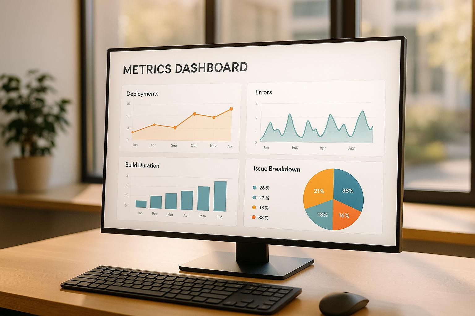
At the heart of every effective DevOps dashboard are the DORA metrics. These four key measurements balance speed with stability, offering a clear snapshot of your development pipeline's health [4].
Deployment frequency: Tracks how often code is released to production. High-performing teams deploy multiple times daily, while others may only manage weekly or monthly releases [1]. This metric indicates how quickly teams can adapt to market needs and user feedback.
Lead time for changes: Measures the time from code commit to production deployment. Elite teams achieve this in hours, whereas others may take days, weeks, or even months [1]. Short lead times point to a streamlined pipeline that delivers value faster.
Change failure rate: Calculates the percentage of deployments that cause production issues needing urgent fixes. Top teams keep this rate between 0% and 15% [1], reflecting their ability to deliver reliable updates.
Mean time to recovery (MTTR): Indicates how quickly service is restored after a failure. High-performing teams recover in under an hour, compared to up to a week for others [1]. This metric is vital for maintaining customer trust and minimising disruption.
In addition to DORA metrics, several other measurements can provide deeper insights:
- Cycle time: Tracks the duration from starting work to delivering it to customers.
- Defect escape rate: Reflects the number of bugs that make it to production, highlighting testing effectiveness.
- CI test failure rate and code coverage: Evaluate the reliability of the pipeline and the thoroughness of testing [4].
Another critical metric is system uptime, which directly impacts service reliability. Even small differences in uptime percentages can have significant business consequences. For example:
| Uptime | Annual downtime |
|---|---|
| 99.9% | 8 hours, 45 minutes, 56 seconds |
| 99.99% | 52 minutes, 35 seconds |
| 99.999% | 5 minutes, 15 seconds |
Lastly, cloud spending metrics are becoming increasingly relevant as organisations expand their cloud usage. According to HashiCorp, 66% of organisations increased cloud spending in 2024, but 91% also reported waste [6]. Metrics like cost per deployment, resource utilisation, and budget variance can help keep spending under control.
Choosing Metrics for Different Team Members
Different roles within a team require tailored metrics to drive meaningful improvements:
Developers: Focus on metrics like CI test failure rates and code coverage. These provide direct feedback on their work and highlight areas for improvement.
Operations teams: Prioritise system health and infrastructure performance. Key metrics include MTTR, system uptime, error rates, and resource utilisation to ensure reliability and plan capacity effectively.
Engineering managers: Need a broader perspective. Metrics like lead times, deployment frequency, and cycle times help pinpoint bottlenecks and guide resource allocation.
Executive stakeholders: Look for high-level indicators that connect technical performance to business outcomes. Metrics such as deployment frequency, system reliability, and cloud costs provide insights into the return on DevOps investments.
The goal is to ensure each team member has access to the data they need - no more, no less.
Pros and Cons of Common Metrics
Each metric has its strengths and limitations, and understanding these trade-offs is crucial for effective tracking. Here's a breakdown:
| Metric | Benefits | Drawbacks | Complexity |
|---|---|---|---|
| Deployment Frequency | Reflects delivery speed | Can prioritise quantity over quality; may be gamed with trivial deployments | Low |
| Lead Time for Changes | Highlights efficiency and bottlenecks | Requires precise tracking; varies by change type | Medium |
| Change Failure Rate | Balances speed and stability | May discourage necessary refactoring; doesn't account for severity | Low |
| MTTR | Drives operational improvements | Hard to measure consistently; may favour quick fixes over proper solutions | Medium |
| Code Coverage | Shows testing thoroughness | High coverage doesn’t guarantee quality; may slow development | Low |
| System Uptime | Easy to interpret; impacts customer experience | Misses performance degradation and intermittent issues | Low |
Cost metrics can be particularly challenging. While tracking cloud spending is essential - especially with 91% of organisations reporting waste [6] - accurate implementation requires careful tagging and attribution.
Security metrics are also gaining importance. In 2024, GitLab reported security as the top IT investment priority [6]. However, these metrics often lag behind incidents, making them more reactive than proactive.
The most effective strategy combines multiple metrics. Top-performing teams, for instance, achieve 127 times faster lead times, 182 times lower change failure rates, and 2,293 times faster recovery compared to low performers [5]. These striking differences highlight the value of tracking and improving across several areas simultaneously.
At Hokstad Consulting, we specialise in helping teams select and implement the right metrics, ensuring dashboards deliver actionable insights rather than just flashy visuals. For more information, visit Hokstad Consulting.
Building Clear and Useful Dashboards
Creating a dashboard that aids decision-making requires more than just displaying a collection of charts. The difference between a dashboard that empowers users and one that confuses them often lies in thoughtful design choices that prioritise simplicity and clarity.
Rules for Good Dashboard Design
A well-designed dashboard follows the five-second rule: within five seconds, anyone should understand the key message or status it conveys. To achieve this, remove unnecessary elements and focus on highlighting the most critical metrics.
A clear visual hierarchy is essential to avoid overwhelming users. Start by placing the most important metrics in the top-left corner, as this is where the eye naturally begins. Use size and colour strategically - for instance, a bright red alert for system downtime immediately grabs attention, while less urgent metrics can be smaller and subtler.
When using colour, ensure it's both intuitive and accessible. Red typically signals issues, green indicates normal conditions, and amber serves as a warning. However, don't rely solely on colour cues - about 8% of men and 0.5% of women have colour vision deficiencies. Adding icons or text alongside colours ensures everyone can interpret the information correctly.
Selecting the right chart type is equally important. Line graphs are ideal for showing trends over time, such as system response times or deployment frequencies. Bar charts work best for comparing discrete values, like error rates across services. Avoid pie charts with more than three or four categories, as they can be hard to interpret accurately.
The layout also plays a key role in usability. Use white space to reduce visual clutter and group related metrics together for better readability. Overcrowding the dashboard with widgets can make it harder to extract meaningful insights.
Finally, apply progressive disclosure to keep things simple. Start with high-level summaries and allow users to drill down into details when needed. For example, show an overall system health metric that expands to reveal the status of individual services on demand.
By following these principles, dashboards can become powerful tools that not only look clean but also enable teams to make informed decisions quickly.
Customising Dashboards for Different Roles
A single dashboard cannot meet the needs of every user. Different roles require tailored perspectives on the same data, and successful dashboards take this into account [2].
- Developers benefit from dashboards that provide immediate feedback. Metrics like code coverage, test failure rates, and build times help them evaluate the impact of their changes.
- Operations teams need a real-time view of system health and performance. Dashboards should prominently display metrics such as mean time to recovery (MTTR), system uptime, error rates, and resource usage. Clear thresholds can help distinguish minor issues from critical ones.
- Engineering managers require a broader view to identify bottlenecks and optimise resources. Metrics like lead times, deployment frequency, and team velocity provide insights into overall process efficiency. Visibility into workloads can also help monitor team well-being.
- Executives focus on the business impact of technical performance. Their dashboards should translate technical metrics into business terms, such as showing how faster deployments improve customer satisfaction or how error rates affect user experience.
Using role-based access control ensures that each team member views only the information relevant to their responsibilities [2]. This approach not only improves usability but also encourages widespread adoption of the dashboards.
Organising Dashboard Layout and Navigation
Once dashboards are tailored to specific roles, the next step is to arrange the layout for seamless navigation. A well-organised dashboard tells a coherent story about the system's health, guiding users through key insights effortlessly.
The inverted pyramid structure works particularly well for DevOps dashboards. Place high-level, critical metrics - like overall system status and major alerts - at the top. Departmental or service-specific metrics can occupy the middle section, with detailed breakdowns at the bottom.
Grouping related metrics helps users scan the dashboard more efficiently. For example, cluster deployment metrics together, group security indicators in one section, and separate cost-related metrics. This logical grouping reduces mental effort and makes it easier to locate specific information.
Consistency across dashboard views is also crucial. If a key metric appears in the top-right corner of one view, ensure it stays in the same position across others. Predictable layouts help users build familiarity and confidence.
Responsive design is another important consideration. Dashboards should remain functional across different devices, from desktops to tablets. Test layouts on various screen sizes to ensure usability isn't compromised.
Contextual information can further enhance user understanding. For instance, a 15% error rate might be critical for a payment system but acceptable for an experimental feature. Adding brief explanations, normal ranges, or comparison baselines provides clarity without cluttering the interface.
Time controls should be easy to access and consistent across views. Users often need to correlate events over specific periods, so tools for adjusting time ranges or zooming into incidents, like a deployment at 14:30, can greatly improve usability.
Ultimately, the best dashboards allow users to focus on the data itself rather than struggling with the interface. When users can quickly assess system health, pinpoint issues, and take action, the dashboard design has done its job.
At Hokstad Consulting, we specialise in creating dashboard systems that turn raw data into actionable insights, ensuring every team member has the information they need to excel. For more details, visit Hokstad Consulting.
Setting Up and Maintaining Metrics Dashboards
Creating dashboards that are both effective and enduring requires a well-thought-out approach. It’s not just about the initial setup; it’s about ensuring they remain relevant and valuable as business needs evolve.
Steps to Build Dashboards Successfully
The first step in any dashboard project is to define its purpose. Think about who will use it and what decisions it should help them make. Without clear objectives, even the best tools and designs can miss the mark.
Assigning responsibilities early on is crucial. Who will gather the data? Who will maintain the dashboard? And who will handle feedback from users? These roles are especially important when multiple teams contribute metrics or when dashboards cater to various levels within an organisation.
Choose tools that fit seamlessly into your existing DevOps setup. Dashboards should automatically pull data from systems like Jenkins, Prometheus, AWS CloudWatch, or GitHub Actions. This integration ensures that key metrics are always up to date without manual intervention.
Automating data pipelines is another essential step. For instance, critical metrics should refresh in real time, deployment data hourly, and trend analyses daily. This automation reduces the risk of outdated information and lightens the maintenance load.
Before rolling out the dashboard, share a draft version with stakeholders. Clearly outline the actions that should result from the insights it provides. This step ensures the dashboard aligns with real-world needs.
Testing is equally important. Simulate different scenarios to confirm the dashboard performs reliably. Check that alerts trigger as expected during incidents, that it handles high traffic smoothly, and that visualisations remain clear even with unusual or edge-case data.
Once the dashboard is live, don’t stop there. Continuously refine it to keep up with changes in processes and requirements.
Keeping Dashboards Relevant Over Time
Maintaining dashboards isn’t just about fixing broken elements or updating visuals. Regular audits - ideally every quarter - help identify and remove outdated metrics, ensuring the dashboard stays aligned with business goals. Without these reviews, dashboards can become cluttered, leading to confusion and inefficiency.
As teams grow and their practices evolve, their data needs will change. For example, developers might initially focus on build success rates but later require insights into code quality or security issues. Similarly, operations teams may shift their focus to more detailed service-level indicators.
Changes in technology also play a role. Whether it’s adopting new tools, switching cloud providers, or implementing updated monitoring solutions, dashboards need to adapt. This might involve reconnecting data sources, tweaking queries, or redesigning visualisations to accommodate new formats.
To prevent dashboard sprawl, use parameterised templates. These allow users to view relevant data by selecting specific services or environments, rather than creating separate dashboards for each scenario. This approach keeps things organised and consistent.
Performance is another critical factor. Slow-loading widgets or inefficient queries can frustrate users. Regularly monitor query execution times, optimise data aggregation, and cache calculations that don’t require real-time updates to ensure a smooth experience.
Connecting Dashboards with Existing Tools
A dashboard’s real value comes from how well it integrates with your existing workflows. It’s not just a standalone display; it should fit seamlessly into your toolchain.
By linking dashboards with CI/CD pipelines and monitoring tools, you create a comprehensive view of the software development lifecycle. For instance, connecting to platforms like Jenkins, GitLab, or Azure DevOps can showcase build success rates, deployment frequency, and lead times. Tools such as Prometheus, Datadog, and AWS CloudWatch provide infrastructure metrics, application performance data, and aggregated logs. The key is to present this information in context, making it actionable rather than just raw data.
Take ServiceNow as an example. Their incident management dashboards combine logs, error messages, infrastructure metrics, and deployment history. This centralised view simplifies post-mortems by offering all the data needed to understand failures and prevent repeats. For instance, if HTTP request failures spike after a deployment, the dashboard can quickly point to a rollback candidate.
Dashboards also become more proactive when integrated with alert systems. Metrics-based alerts, tied to notification systems, reduce the need for constant manual monitoring while ensuring issues are addressed promptly.
Security and usability are equally important. Role-based access control ensures team members see only the data they need. Developers may focus on build metrics, while executives might require high-level summaries. This not only streamlines the user experience but also protects sensitive data.
Finally, mobile responsiveness is a must. Dashboards that adapt to different screen sizes let teams check system status on the go, keeping everyone informed no matter where they are.
Hokstad Consulting helps organisations refine their dashboard strategies to match their DevOps maturity. To learn more about their services, visit Hokstad Consulting.
Need help optimizing your cloud costs?
Get expert advice on how to reduce your cloud expenses without sacrificing performance.
UK-Specific Dashboard Requirements
DevOps dashboards in the UK need to align with local formatting conventions and comply with stringent data protection laws. These factors influence both the user experience and legal responsibilities.
Using UK Formats in Dashboards
Adhering to British formatting standards is essential. For instance, dates should follow the DD/MM/YYYY format instead of the American MM/DD/YYYY style. A deployment noted as 03/04/2024 should be clearly understood as 3rd April 2024 to avoid any misinterpretation. Similarly, currency should always be displayed in pound sterling (£) with proper decimal formatting - for example, £1,234.56, not in dollars or euros. Time should adhere to the 24-hour clock, so 14:30 is preferred over 2:30 PM, ensuring clarity and consistency.
Measurements should also reflect local conventions. Server temperatures should be shown in Celsius (°C), storage in gigabytes (GB) or terabytes (TB), and network speeds in Mbps or Gbps. When presenting large numbers, use commas for thousand separators and full stops for decimals - for example, 1,234,567 API requests. While these formatting details improve usability, compliance with UK data protection laws is equally crucial.
Meeting UK Data Protection Requirements
Beyond offering actionable insights, dashboards must prioritise the protection of user data - a particularly stringent requirement in the UK. Compliance extends beyond the General Data Protection Regulation (GDPR) to include the Data Protection Act 2018 and UK-GDPR, which impose specific obligations on organisations managing personal data.
Data minimisation is key: only collect and display metrics that serve a legitimate business purpose. Any tracking must have a clear legal justification.
To simplify compliance, organisations can use privacy governance dashboards. These tools centralise data protection activities, such as consent management and regulatory accountability. By adopting such systems, businesses often reduce their manual compliance reporting workload by 60–80% [7].
Non-compliance carries significant risks. Penalties can reach up to £17.5 million or 4% of global annual turnover, whichever is higher [8]. A 2023 survey revealed that 74.4% of privacy professionals believe most companies would fail a GDPR inspection [9]. Real-time monitoring is critical to maintaining compliance in fast-paced DevOps environments. Automated tools can flag potential issues before they escalate into regulatory problems.
Dashboards should also track data processing agreements with third-party vendors, ensuring integrations with external services - like monitoring tools or cloud providers - are governed by appropriate contracts. Role-based access controls are another essential feature. Developers should access build metrics and deployment data, while executives view high-level summaries without exposing sensitive operational details.
To further demonstrate compliance, dashboards can monitor staff training and log regular audits of data processing activities. This approach aligns with the Information Commissioner’s Office (ICO) expectations for continuous compliance.
For organisations seeking tailored guidance, Hokstad Consulting offers expertise in navigating these challenges. Their deep knowledge of cloud infrastructure and data protection ensures that dashboards meet both operational and regulatory demands effectively.
Conclusion
Dashboards act as the nerve centre for DevOps operations, reshaping how teams monitor and improve software delivery. Research highlights that organisations adopting solid DevOps practices supported by effective dashboards see a 22% drop in IT costs, a 30% rise in deployment rates, and a 30% boost in developer productivity [3].
A staggering 75% of developers lose 6–15 hours each week navigating scattered tools [10]. This inefficiency can be eliminated with a centralised, well-structured dashboard. Beyond saving time, dashboards provide real-time insights and foster better collaboration among all stakeholders [2].
The devil is in the detail: selecting metrics that align with business goals, designing user-friendly interfaces, and ensuring compliance with UK-specific regulations are essential. A well-crafted dashboard bridges technical data and strategic objectives, helping teams identify bottlenecks and reduce costs [2].
For UK organisations, where balancing strict data protection laws with operational effectiveness is critical, a thoughtfully designed dashboard does more than meet compliance standards - it delivers tangible business results. These tools shift teams from reactive problem-solving to proactive decision-making, turning raw data into actionable strategies that drive success.
If you're ready to harness these benefits, Hokstad Consulting can help. With a strong foundation in DevOps and a deep understanding of UK regulatory requirements, they create dashboards that enhance operational efficiency while ensuring compliance. Let their expertise guide you towards smarter, data-driven decisions.
FAQs
What are DORA metrics, and why should they be included in a DevOps dashboard?
What Are DORA Metrics?
DORA metrics are four key measurements used to evaluate the performance and efficiency of DevOps teams. Here's a quick breakdown of each:
- Deployment Frequency: Tracks how often new code is deployed to production.
- Lead Time for Changes: Measures the time it takes for code to move from being committed to being deployed.
- Mean Time to Recover (MTTR): Calculates the average time it takes to restore service after an incident or outage.
- Change Failure Rate: Indicates the percentage of deployments that result in failures requiring fixes.
Adding DORA metrics to your DevOps dashboard is a smart move. These metrics provide valuable insights into both delivery speed and system reliability. By keeping an eye on them, teams can pinpoint bottlenecks, lower failure rates, and refine their processes. The result? Smoother software delivery and better operational performance overall.
How can DevOps dashboards be tailored to suit the needs of different team roles?
DevOps dashboards can be customised to show metrics, widgets, and data that match the unique responsibilities of different teams or roles. For instance, developers might find it helpful to see dashboards that highlight build statuses and code quality metrics. Meanwhile, operations teams may prioritise deployment performance and system health data.
It's also possible to set permissions, ensuring that sensitive information is only visible to authorised team members. By tailoring dashboards to specific roles, they become more practical and easier to use, helping teams make quicker and more informed decisions.
What should UK-based DevOps teams consider when creating dashboards to comply with local data protection laws?
UK DevOps teams need to make sure their dashboards align with the UK GDPR and the Data Protection Act 2018. This means putting strong access controls in place, encrypting data both when it's being transferred and when it's stored, and making privacy notices straightforward and easy to find.
Dashboards should also include audit trails to show accountability and adhere to essential data protection principles like data minimisation and purpose limitation. Focusing on these steps helps teams stay compliant while protecting sensitive data effectively.